BEFORE:
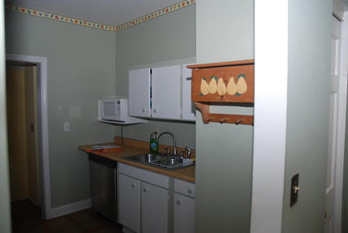
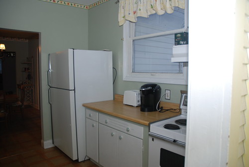
This is what the kitchen looked like when we moved in.


I'm not sure if the photos really do a good job capturing the weirdness and lack of appeal in the kitchen. The wall color was a completely flat, mint-ice-cream green. With low, weird upper cabinets on the right-hand side, it felt more like a laundry room than an actual kitchen. The cabinets were painted the same shade as the wall (with white only on the doors) which made them appear to sort of recede back into the wall. And let's not even talk about those plaid knobs and pulls. PLAID.
(ALMOST) AFTER:
We yanked the upper cabinets down almost right away. When I washed the dishes the first night and my nose was two inches from a cabinet door, I knew they had to go...even if I didn't exactly have a plan for what to do with that wall yet, nor the budget for new cabinetry.
Jon's sister Beth spent last week painting our dining room and kitchen (instead of going on spring break--how nice is that?!) and we made a lot of other little changes that seem to be adding up. Here's the progress so far:

Isn't it amazing how big a difference the new color makes? It's Sherwin Williams "Cottage Cream", and we're using it in the dining room too (even though, oops, we ran out of paint! That'll be done next week). Also, I took down the ugly curtains. I need some kind of window solution, because the morning sun blinds me when I'm making my toast and tea...but those things had to go.

The board leaning against the wall is one of the shelves my husband sanded and stained. As soon as he's got the second one done they'll go up above the sink.

Not much to look at on this side right now, but I think it already looks a lot better without the upper cabinets. (We do need to take down the painter's tape and put up some outlet and switch plates, though!) We aren't sure why previous owners opted to cut a hole in the countertops and run the cords for the dishwasher and garbage disposal UP the wall instead of concealing them below...but that's also on our to-fix list.

Just another view of the window side. The stove is really in bad shape...I hope we can get that replaced soon. On the other hand, we thought we'd hate the disco-era fridge, but we're finding it extremely functional. It's just way too big for the room.

Another shot of the kitchen from the back door/pantry area. You can see how nice that stained wood will look against the color of the kitchen.
The kitchen still needs a lot of work, of course! But it's so much more livable now than it was just a couple of weeks ago, and the only money spent on it so far was for paint, lumber, stain, and hardware. Less than $150 all together.
I'm not exactly sure why the sink isn't under the window, but flip-flopping the room is definitely on our big-picture to-do list, as is swapping out the lower cabinets for something a little better made. Our short-term plan is a new coat of paint (almost done...but we ran out of paint, as you can see there above the stove, so it's temporarily on hold!), new hardware, and open shelving on the current sink side.
Longer-term plans include tearing up the ugly vinyl flooring (we're hopeful that we'll find wood beneath it like we did in the dining room; if not, we'll consider Marmoleum linoleum "click" tiles), new countertops--I'd like a natural surface like wood, (something I won't mind dinging and scuffing up...nothing ultra-slick or shiny like granite, just not my style); possibly opening up the doorway between the kitchen and dining room, and/or stealing what is currently a linen closet in the dining room to create a built-in pantry in that back corner the shelf is leaning against. Or, we could take that closet out and we'd gain some extra space, maybe for a hutch or Hoosier cabinet. I like the idea of having a piece or two of freestanding furniture in the kitchen, IF we can make it work with the limited amount of space we've got.

This picture (from the magazine Small-Space Decorating) is hanging on my fridge as inspiration. I love its simplicity, vintage feeling, warmth and the natural wood shelving and countertops. I'm also totally in love with that stove. There's a vintage (1940s, we think) gas stove in the basement and Jon's looking into restoring it--if we're successful, what a fantastic focal point it would make!
Other photos that have served as inspiration along the way included this beautiful hutch and a rustic farmhouse kitchen with a distressed blue island, both from Kitchen & Bath Ideas magazine (by Better Homes & Gardens).
And when I saw this unfitted kitchen from designer/author Ingrid Abramovitch, my heart nearly stopped. The truth is, I've been watching home renovation shows for months and flipping through countless magazines and I have yet to get excited about a set of cabinets. High-end or low, custom or RTA, they have all seemed more like a necessary evil than something I actually fall in love with. And at that price tag, it seems like I should love them, doesn't it!? I have nothing against cabinets and think they are often quite lovely. But I just don't see the point of making a huge investment in floor-to-ceiling cabinetry when it doesn't "do it" for me.
Several among our family and friends have expressed concern over the open shelving/"unfitted" kitchen concept we're going for--namely the lack of storage space for "ugly" stuff like plastic containers. I'm finding that, so far at least, it's not a big issue. The cabinets below the window have four large wire pull-out bins where I'm storing plastic containers, pot/pan lids, plastic cups and bowls, and potatoes and onions. There are another couple of lower cabinets and drawers where I'm storing commonly used foods that don't go in the fridge like bread and peanut butter, baggies/foil/plastic wrap, dish towels and pot holders. There's a huge drawer that's plenty big for most of our utensils and silverware, and we've got a stainless steel pitcher on the counter where we keep the most commonly-used stuff. The less-often-used packaged foods go in the sizable pantry (near the back door) along with cleaning supplies. We've always kept fruit in a bowl on the dining room table and incoming paperwork goes on the buffet in the dining room. Spices/seasonings are in a basket on the shelf above the stove. Sugar, flour, and brown sugar are in three canisters that will go either on the counter or on the shelves. The pots and pans will hang somewhere--we haven't decided where yet. And all my decorative bowls, nice platters, and matching plates/bowls/mugs will go on the open shelving. I figure the less I can "hide" my things behind doors, the more likely I'll be to keep track of what I've got and store it neatly. I'll share more pictures of kitchen organization after the shelves are up so you can see the big picture.
Back this week with pictures of what I think is the biggest transformation so far--the dining room. It's still a work in progress, but it's so close I can't help but share. Thanks for following along!

I love the new color! It's so warm and home-y!
ReplyDeleteLisa Trahms
My last house had stainless appliances and I kind of came to hate them. My "new" house (we've lived here 2.5 years now) has a kitchen similar to the way you fixed yours up. It has white cheap appliances and random bright thrift store stuff everywhere and I LOVE THIS KITCHEN. I am looking forward to checking in on this blog, I LOVE home stuff.
ReplyDeleteI love how fresh and clean the kitchen looks ... I have been paring down lately, too, and aiming for simplicity in my redecorating and renovation projects. Nice job!
ReplyDeleteI keep checking back everyday! I want more please! The kitchen is great!!! Please let's see more:)
ReplyDelete